
A web page without any styling is like a blank canvas. The possibilities are endless, and it’s easy to waste time experimenting with different layouts, colors, and fonts. But the default browser styles are not ideal, so you need to put in the effort just to get started with a proper design.
The following styles will provide a solid foundation that you can later build on. With usability concerns addressed and basic design principles in place, you can focus on your content or continue to refine your design from there.
More Logical Box Sizing
If you’ve learned CSS from the ground up, you should have a good understanding of the box model. But if you’re unfamiliar with the concept, it can be a confusing one to wrap your head around. Even when you know what’s going on, working with the browser’s default model can be awkward, so I recommend you reset box-sizing like this:
        html { box-sizing: border-box; }
*, *:before, *:after { box-sizing: inherit; }
The default value for box-sizing is content-box. With that setting, any width and height properties you apply to an element will not include padding, border, or margin. For example, you might want an element to take up half the width of the page:
#about { width: 50%; padding: 8px; }
This will result in a total width of half the container’s width plus 16 pixels (8 pixels on either side). The border-box value for box-sizing will ensure that width and height properties include padding and borders, making it much easier to create an element that is exactly half the width of the page.

Related
11 Tips for Getting Started With Modern CSS
Style tips that won’t go out of fashion.
In short, border-box is a more intuitive way of declaring sizes and will probably cause you fewer problems in the long run. By applying it to the html element, and then setting all other elements to inherit that value, you can easily override it if you need to.
Optimal Line Length
There’s a reason most books and magazines are in portrait orientation: long lines can be difficult to read. When your eye reaches the end of a line and moves back to the beginning of the next one, it has to switch focus quickly. The further it has to move to do so, the more difficult that is.
Typography guides generally recommend a line length of between 45 and 75 characters. You can use the max-width property to ensure your lines contain no more than a certain number of characters, using the ch unit:
html { max-width: 70ch; }
The ch unit is relatively unknown, but it’s becoming more and more important. This unit represents the width of a 0 character in the relevant font, so it’s a great way to ensure an approximate number of characters per line.
It’s impossible to specify an exact number of characters per line because of variable-width fonts. But this approximation is, for the most part, more than good enough.
Horizontally Centered Content
Once you’ve set a line length, your content will be aligned on the left side of the page. Unless your font size is very big, this will often look unbalanced, particularly for anyone using a widescreen monitor. It’s much more comfortable for a reader to look straight ahead than to turn their head.
The simple fix is to align your content in the center of the browser window by giving it equal margins on the left and right:
html { margin: auto; }
This only works when the element—the HTML tag, in this case—has a constrained width. If it’s a full-width element, there will be no margins to balance. The max-width property set earlier means that, with any larger window, the content will be centered with equal horizontal margins.
A Comfortable Measure
In typography, leading refers to the vertical space between lines of text. CSS calls this “line height” and specifies a default value of “normal” which browsers typically interpret at around 1.2. In other words, a line of text will have approximately 10% of its height added as space above and below it.
The term “leading” (pronounced “ledding”) originates from the strips of lead used to separate lines of type in traditional mechanical presses.
The default value is OK but, as with line length, it can cause legibility problems. The value you use should ultimately depend on the font, line-length, and the average number of words in your paragraphs, but a good overall compromise is 1.4, approximately twice as much space as the default:
html { line-height: 1.4; }
A More Legible Font Size
The default font-size in most browser environments is 16px, and it has been for a long time. As screens get higher resolutions, this produces smaller and smaller text which, at some point, gets too uncomfortable for most tastes. But the default remains the same.
Related
These 10 Fun Games Will Teach You Modern CSS
Challenging. Strategic. Satisfying.
The following declaration uses relative units—em—to bump up the font size from what it would otherwise be. In the default case, this takes a 16px font and increases it to 20px.
html { font-size: 1.25em; }
It’s important to note the advantage of this approach over font-size: 20px. Using em means that, if the user changes their browser settings and picks a smaller or larger font than the default, your page will scale proportionally.
Appropriate Header and Body Fonts
By default, your browser will display text in a serif font. While this is fine for body text, it’s generally accepted that sans-serif headings combine better with a serif body font. Many font families come in pairs of serif and sans-serif, specifically for this reason.
h1, h2, h3, h4, h5, h6 { font-family: sans-serif; }
A good template should use the generic font families: serif and sans-serif. These are guaranteed to be available and, much like font size, the user can still choose their preferred font in a browser like Chrome:

Using these styles as a baseline, you can add more nuance with a font stack, choosing unique fonts that complement your design, while keeping the generic families as a fallback.

Related
What Do “Serif” and “Sans Serif” Mean?
Serif? Sans serif? What does that even mean?
Easy Responsive Images
Images that escape their containers can look ugly at best and break your website’s layout at worst. If you’re not keeping very tight control over the images on your site—especially if they can be uploaded by users—this is an easy trap to fall into.
The easiest safety net is to ensure all images on your page are no wider than their container. The max-width property lets you do so:
img { max-width: 100%; height: auto; }
Note that height: auto is required to maintain the original image’s aspect ratio, if you specify dimensions in your image tags, like this:
<img width="800" height="400" src=" />
With this markup, the max-width property may trim the width, but it won’t have any effect on the height, so your image will end up stretched without height: auto.
A Suitable Color Contrast
Good color contrast is key to readability. If your text color is too similar to your background color, it can be difficult to read. This goes double (or more) for people who have difficulty perceiving certain colors.
The Web Content Accessibility Guidelines require a contrast ratio of at least 7:1. For reference, the contrast ratio of black text (#000000) on a white background (#ffffff) is 21:1, which passes the contrast test with flying … colors. However, such a stark contrast has a downside: it can put strain on the eyes, caused by the need to adjust between such different brightnesses.
A very subtle change can make all the difference; not so much that you’d notice, but enough that your eyes will:
html { color: #333; }
This very dark gray has a contrast ratio of 12.63:1 on a pure-white background, almost half that of pure black, but still easily surpassing the 7:1 requirement.
Removing Link Underlines
Ever since HTML arrived in the early 1990s, a truism has persisted: links are blue and underlined. This is the default and, for the most part, it has worked well as a usability feature, informing the reader exactly which parts of a document they can click on.
However, link underlining can clash with your design and, depending on the length of your links, can look ugly and can even harm the readability of your text. When CSS became popular, another truism took hold: designers turn off link underlining.
Whether you decide to do this or not is up to you, but a common technique is to hide the underline by default, and show it when the reader moves their pointer over the link:
        a:link { text-decoration: none; }
a:hover { text-decoration: underline; }
Links will still appear in blue, so they should remain recognizable. If you navigate them using the keyboard, they won’t be underlined, but the browser’s default outline style will apply, ensuring you can still identify them.
The Complete CSS
These styles will not necessarily all apply to your design. But they are a good basis to work from, and they make simple documents attractive enough.
The Code
html {
box-sizing: border-box;
max-width: 70ch;
margin: auto;
font-size: 1.25em;
color: #333;
line-height: 1.4;
}* {
box-sizing: inherit;
}
h1, h2, h3, h4, h5, h6 {
font-family: sans-serif;
}
img {
max-width: 100%;
height: auto;
}
a:link {
text-decoration: none;
}
a:hover {
text-decoration: underline;
}
The Results
This screenshot shows a sample HTML document, with many core elements, rendered using a browser’s default style:

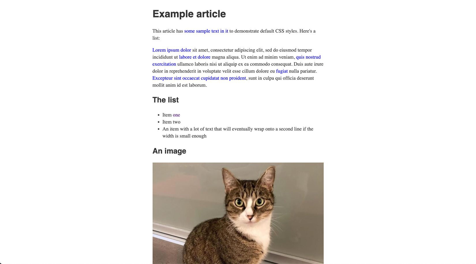
This screenshot shows the same document with the minimal style sheet above applied:
The styles presented here should improve the basic minimum design of a typical HTML file, with improvements to readability and overall layout. Try them out with your own documents or websites, and keep learning CSS to improve your knowledge and polish your designs further.


Leave a Comment
Your email address will not be published. Required fields are marked *